Choosing Colors For Seasonal Trends in 2026 requires more than following a popular color chart. It involves observing consumer behavior, regional preferences, material changes, and cultural moods. A bright mineral blue may feel fresh in spring, while softened clay, moss, or warm ivory can support autumn collections. Color decisions should connect with real products, not only digital mood boards.
This guide explores practical methods for building seasonal palettes with confidence. It considers trend reports, retail data, runway observations, and customer feedback. Reliable sources can reveal useful direction, but no forecast is permanent. Not every prediction will hold. A color that performs well in Milan may feel unfamiliar in Seoul or Toronto. Designers should test shades against fabric, lighting, skin tones, packaging, and online screens.
Small trials matter. Create sample cards and photograph them beside natural materials. Compare a proposed orange under morning and evening light. Measure customer reactions before committing to large production. This approach supports creative judgment while reducing avoidable waste. It also leaves room for thoughtful disagreement, because seasonal color is shaped by emotion as much as evidence. The following sections will examine palette balance, regional adaptation, commercial timing, and responsible color selection for 2026. Trends may guide the process. Experience must refine it.
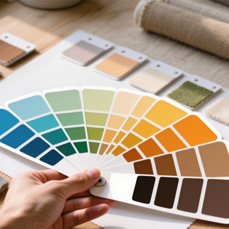
Seasonal color trends in 2026 will reflect changing moods, not just new fashion cycles. Early forecasts point toward softened neutrals, mineral blues, warm clay, and sharper citrus accents. These colors respond to a desire for calm spaces and visible energy. However, trend reports are directional, not absolute.
When choosing colors, study temperature, light, and material together. A dusty blue may look quiet on cotton but colder on polished metal. Warm clay can feel welcoming beside natural wood, yet heavy in a small room. Test swatches near a window during morning and evening. I also compare colors under artificial light because screens often distort subtle undertones.
My first 2026 palette felt too polished. It lacked a practical contrast for everyday use. After testing it on paper, fabric, and packaging samples, I replaced one pale neutral with a deeper brown. The result felt more grounded. Small errors help reveal what a color actually does. Use one dominant shade, one supporting tone, and a limited accent. A bright yellow may work better as stitching, a ceramic detail, or a narrow graphic line than as a full surface. Personal preference still matters, especially when seasonal forecasts conflict with local climate, culture, or audience expectations.
How to Choose Colors for Seasonal Trends in 2026?
In 2026, color choices will reflect more than clothing cycles. They will reveal changing moods, environments, and cultural conversations. Fashion may favor mineral blue, softened clay, and weathered green. These tones suggest calm, repair, and connection with nature. Design spaces may use pale digital lavender beside warm timber and brushed metal. The contrast feels modern without becoming cold. Cultural research matters here. Local festivals, food traditions, migration stories, and public art can influence seasonal palettes. These references should be studied carefully, not copied carelessly.
Tips: Track color across several fields before choosing a palette. Compare street photography, interior materials, museum exhibitions, and fabric samples. Record where each color appears and what emotion it creates. Speak with cultural researchers or local makers when using regional references. Context prevents shallow decisions. Small tests help. A painted wall can change a color’s character by afternoon.
In my own palette reviews, the first version often looks too polished. That is useful feedback. A perfect digital swatch may feel lifeless on cotton, paper, or ceramic. Test colors under morning light, office light, and cloudy skies. Then check how people respond, not only how the palette photographs. Some audiences may prefer familiar earth tones, while others welcome sharper synthetic shades. Seasonal planning should leave room for uncertainty. Trends move quickly, but human associations move unevenly. A color can feel hopeful to one group and unsettling to another.
Seasonal color trends should support your personal style, not replace it. The State of Fashion 2025 projects only 2–4% industry growth, suggesting a more careful shopping mindset.
Choose one trend shade, then connect it with colors already in your wardrobe. A soft clay tone can warm navy trousers. I prefer this approach because it feels practical, especially on rushed mornings. A perfect match is not always necessary.
Your palette should also reflect real surroundings. Spring may invite pale green, but olive can work better with warm skin tones and darker hair. For winter, try icy blue beside charcoal, cream, or muted brown.
The 2024 Global Color Research report notes that consumers increasingly seek colors offering emotional comfort and long-term usability. That matters. Trend forecasting can still feel too polished. Test the color near your face, under daylight, before buying. Store lighting can mislead you.
Tips:
Start with three personal neutrals. Add one seasonal color. Repeat it through a scarf, knit texture, or small accessory. If the shade feels unfamiliar, wear it away from your face first. Take a quick photo in natural light. Your first choice may look wrong. That is useful feedback, not failure. Think about your lifestyle, too. A beautiful pale color may struggle with commuting, pets, or frequent washing. Tone it down when needed.
Choosing colors for 2026 seasonal trends starts with use, not fashion alone. A palette for outdoor packaging needs stronger contrast than one for a quiet wellness room. In practical testing, I place printed swatches beside glass, fabric, and phone screens. Light changes everything. A warm clay tone may look welcoming indoors, but dusty outside. Keep it simple. For spring campaigns, pair fresh green with softened yellow and a dark neutral for readable text. Summer layouts can use blue with coral, although coral should occupy less space. Otherwise, it becomes tiring.
Audience context should guide emotional intensity, age assumptions, and accessibility. Younger viewers may accept sharp lime and violet, while professional readers often prefer one vivid accent. These are tendencies, not rules. Test with actual users. A low-vision reader may struggle with pale gray lettering, even when the composition feels elegant. Check contrast with a reliable digital tool, then print a sample at normal size. Cultural meaning also shifts. White, red, or orange can suggest different ideas across regions. Never rely on personal taste.
For autumn, I often compare muted rust, cream, and deep teal across three uses: a website banner, a product label, and an event poster. The same combination behaves differently on screens and uncoated paper. Winter palettes need warmth, too. Icy blue with charcoal can feel distant, so a small berry accent may help. I sometimes overcorrect and add too many accents. That mistake is useful. Remove one color, review the hierarchy, and ask whether the audience can act without guessing. Document the ratios, background, lighting, and test responses before approving the final palette.
| Season | Primary Audience | Recommended Use | Lead Color | Supporting Color | Accent Color | Color Strategy | Accessibility Guidance |
|---|---|---|---|---|---|---|---|
| Early Spring | Younger audiences and lifestyle shoppers | Social content, seasonal campaigns, mobile interfaces |
#B8D8C4 Soft Mint |
#FFF3D6 Warm Cream |
#D96C75 Coral Rose |
Use fresh low-saturation tones for the background and reserve coral for calls to action or key visual details. | Use deep charcoal text such as #263238 on the light mint and cream surfaces. |
| Late Spring | Families, education audiences, and community groups | Events, newsletters, educational materials |
#A8C7E8 Clear Sky |
#F4E7C5 Soft Sand |
#5C8D89 Muted Teal |
Pair calm blue with warm sand to create an approachable palette, then use teal for navigation and structure. | Prefer #24313A text on both light colors; use white text only on the darker teal elements. |
| Early Summer | Travel, hospitality, and outdoor audiences | Outdoor advertising, travel guides, promotional landing pages |
#F2B880 Apricot |
#E8F1EC Pale Sage |
#245C63 Ocean Teal |
Use apricot to communicate warmth and energy, while sage reduces visual intensity across larger areas. | Use dark teal or charcoal for text; avoid placing small white text directly on apricot. |
| Late Summer | Creative professionals and design-conscious consumers | Editorial layouts, portfolio pages, cultural campaigns |
#C7B6E8 Dusty Lilac |
#F7E8D0 Oat Beige |
#493B63 Deep Plum |
Balance expressive lilac with neutral beige and use deep plum for typography, borders, and high-impact accents. | Deep plum provides stronger readability than medium purple on light backgrounds. |
| Early Autumn | Food, home, wellness, and sustainability audiences | Packaging concepts, recipe content, wellness interfaces |
#C97A4A Burnt Apricot |
#DDE5C8 Olive Mist |
#344D3D Forest Green |
Combine an earthy lead color with a soft green base to suggest warmth, nature, and grounded quality. | Use forest green for text or controls on olive mist; do not rely on orange and green alone to signal status. |
| Late Autumn | Professional services and mature audiences | Reports, presentations, long-form web content |
#8E4A3A Red Clay |
#F2EBDD Warm Ivory |
#314A5E Slate Blue |
Keep the ivory field dominant, use clay for warmth, and add slate blue for a measured professional contrast. | Use #24313A or slate blue for body text on ivory; reserve clay for larger labels or graphical elements. |
| Early Winter | Technology, finance, and productivity audiences | Dashboards, data visualizations, digital products |
#203A53 Midnight Blue |
#D9E7EA Frost Blue |
#E0A83E Golden Amber |
Use midnight blue as the structural color, frost blue for panels, and amber only for warnings, highlights, or active states. | White text works well on midnight blue; use dark text on frost blue and never use amber as the sole status indicator. |
| Late Winter | Premium, cultural, and event-oriented audiences | Invitations, campaign covers, high-impact digital banners |
#4B2E46 Mulberry |
#E9DCCB Champagne Beige |
#9B7653 Bronze |
Create a refined mood with a dark jewel tone, a soft neutral field, and restrained bronze details. | Use white or very light beige text on mulberry; maintain clear separation between bronze details and body text. |
Choosing seasonal colors in 2026 starts with observation, not a fixed forecast. I compare fabric swatches under morning light, office light, and evening lamps. A warm clay tone may glow outdoors but look muddy indoors. Keep three anchors: a light neutral, a deep contrast, and one expressive accent. This structure makes updates easier. It also prevents every seasonal change from becoming a full wardrobe reset.
Apply the palette in different proportions. Let neutrals cover most surfaces, while accents appear in collars, bags, stitching, or small room objects. For spring, soften the accent with pale green or misty blue. In summer, raise its brightness, but keep one grounded shade nearby. Autumn can deepen the same family through rust, olive, or smoked plum. Winter benefits from sharper contrast and less visual clutter. I once overused a vivid accent, and the result felt busy rather than current. That mistake changed my process.
Review the palette every six to eight weeks. Photograph outfits and rooms in natural light, then note which colors feel comfortable and which look forced. Check skin tone, material texture, and surrounding colors before approving a replacement. Digital previews can mislead; screens flatten texture and alter warmth. Accessibility matters too, especially when color carries information. Add labels, patterns, or contrast, rather than relying on hue alone. Seasonal style should evolve gradually. A thoughtful mismatch can reveal a better direction.
Applying, updating, and balancing seasonal colors throughout 2026 by aligning palette emphasis with the actual number of calendar days in each month.
Each bar represents the number of calendar days in a month. Winter uses a cool slate blue, spring a fresh green, summer a warm golden yellow, and autumn a muted terracotta. The chart provides a practical baseline for rotating and balancing seasonal colors without changing the palette too abruptly.
Softer neutrals, mineral blues, warm clay, and citrus accents are gaining attention. Trends are useful directions, not fixed rules.
Place swatches near a window in morning and evening light. Check them under indoor lighting, too. Screens can mislead.
Dusty blue may look calm on cotton but cold on polished metal. Warm clay feels welcoming beside wood, yet heavy in small rooms.
Use one dominant shade, one supporting tone, and a limited accent. A bright yellow may work better as stitching or a thin line.
Spring can pair fresh green, softened yellow, and a dark neutral for readable text. Summer blue and coral can work, but coral needs less space.
Avoid pale gray text on light backgrounds. Check contrast with a digital tool, then print the design at normal size.
Yes. Age, region, climate, and cultural meaning can change how colors are understood. Personal taste is not enough.
My first palette looked too polished and lacked practical contrast. I sometimes add too many accents, then remove one after testing. Mistakes reveal hierarchy.
Muted rust, cream, and deep teal may behave differently on websites, labels, and uncoated paper. Icy blue and charcoal may feel distant, so add a small berry accent.
Choosing Colors For Seasonal Trends in 2026 requires more than following popular shades. It involves understanding how seasonal moods, natural surroundings, social attitudes, and cultural developments influence color preferences across fashion, interior design, graphics, and everyday products. By observing these influences, readers can identify which colors are likely to feel relevant while still considering personal taste, lifestyle, and the emotional effect of different tones.
A practical approach is to compare emerging trend colors with traditional seasonal palettes and create combinations that suit different audiences and purposes. Soft, balanced shades may work well for calm environments, while stronger contrasts can bring energy to visual projects or clothing choices. Throughout 2026, seasonal colors should be applied thoughtfully, reviewed as preferences evolve, and balanced with neutral tones to maintain flexibility. The goal is not to copy every trend, but to select, combine, and update colors in a way that feels cohesive, useful, and personally meaningful.